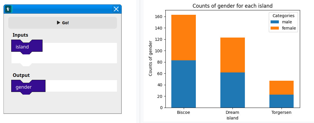
You can plot stacked bar charts from two designated classifiers. These are a way to see the counts of each value.
For example: Below shows us that biscoe has the most amount of penguins on it, and the distribution to male to female is about evenly spread.